US elections provide us with our four-yearly dose of US geography. Some sites have published maps that are more interesting and illuminating than the standard state-by-state red-and-blue ones.
Kieran Healy at Crooked Timber has posted a county-by-county map that comes from (Associated Press via) USA Today . His post is a bit terse because the map has been posted on what’s apparently a right-wing blog, gloating about all the red. (Note to European readers who haven’t been up all election night: in the US, red stands for the Republican candidate/party, blue for the Democrats. Yes, it’s strange.)
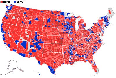
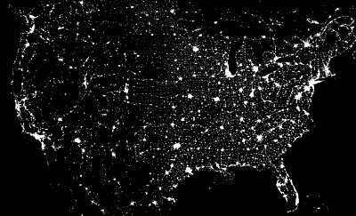
Of course, the dominating red colour corresponds to the rural/urban divide in the US voting pattern. The blue areas are smaller but much more densely populated, for most of them. Note that the grey areas reflect missing data — several of them should be blue, too. Kieran provides a population density map, but a commenter suggests to compare it to a satellite picture taken by night. So here is it, taken from NASA’s Astronomy Picture of the Day collection. The most interesting areas are those where a deeper blue tint doesn’t coincide with very high urbanisation. These are mostly are small towns with high percentages of black or Hispanic voters. Read the entire discussion on Crooked Timber if you are interested. They have links to other maps as well.
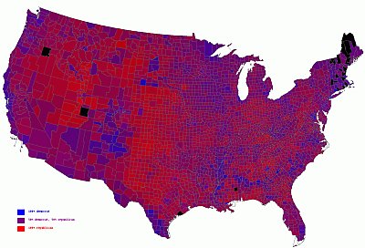
Others, most impressively of all Robert Vanderbei, have coloured the county-by-county map in shades of purple, reflecting the slimness of Mr Bush’s victory margin. Larger versions — very detailled so you can find any county you’re interested in if you know where it is — are available on his site.
The French paper Le Monde does something similar in their (pretty but quite heavy) Flash animation on the election results: instead of interpolating between pure red and blue, the respective coulours are rendered in progressively lighter shades, French-style. I’ve taken a screen shot:
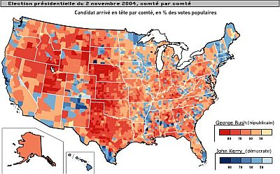
Last, another interesting map from the same Le Monde Flash document: County-by-county breakdown on the changes in percentage points of the vote from 2000, mostly of course in favour of Mr Bush. (This is also a type of map that we usually get from our news sources after elections over here.)
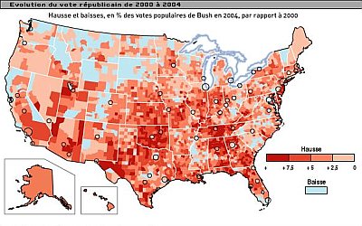
Deeper red means stronger swing to the right. Light blue, any swing to the left.
Images: USA Today, Robert Vanderbei, NASA, Le Monde
Related posts: Elections, elections, Citations d'hier, SNCF : Zero en géo, Meanwhile in France, Love, What's your MP up to?, Poor EU parliament
Technorati (tags): Bush, election, géographie, geography, politics, politique, USA


Very nice collection, but very scary too.
You might also want to look at www-personal.umich.edu/~m… />
Really good take on graphing this stuff.
I am disappointed they choose to use red for one party. Red tends to have a negative connotation. This lends support to the false claim that the party represented by red is angry or mean when the fact is in the past four years the angry, mean party was the left in America. As a moderate independent who sees flaws with both the right and the left, this nevertheless pushed me further right. Perhaps the left will clean up their act, moderate their behavior, and most of all learn not to lie so much or so blatantly if they want to start winning elections.
Thanks for the link, jeev. Yes, Mark Newman’s maps and cartograms are a joy. (Scroll down for the most interesting ones: the counties are coloured in shades of purple and stretched so that their area is proportional to their population). Plus, they are published under a Creative Commons License and can be freely used (with attribution, of course).
A good map from the post election
Yes, US Today is building the county map again, and some not funny lets redraw the US Canadian border maps are popping up. Here’s a good one for a change. Some more on elections and maps. From Pacific Views… The