Adobe’s site has a beautiful page about the history of the ampersand, the way it developed from a ligature of the letters e and t of the Latin word et. (Via Language Hat, who got it from aldibronti at Wordorigins.)
In French, the &-sign is or used to be called pirlouette, perluette, perluète, éperluète or esperluette. The term comes either from packing lat. perna (meaning leg, or a type of cockle), sphoerula and uvula into a single word or (and?) finding a playful rhyme on zed, to be added by children learning the alphabet after saying the letter z “to finish with a pretty rhyme”, according to the site linked to above. (Respectful suggestion: cutting down on the synonyms might be the only way to keep the word from becoming totally obsolete.)

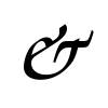
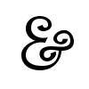
We don’t all have Adobe software and fonts installed, but some beauties are accessible to everyone. The first image (on the left) shows what you get when typing “&” in the URW Chancery L font (installed on my Linux box, I don’t know exactly when or how; maybe it came with Open Office), the second the pretty ampersand of Penguin Attack.

Something tells me that the latter font was probably forged for Linux, but anyone interested can download and use the (TTF) file; it is distributed under the GPL.
In most fonts, either the middle horizontal stroke of the (often) ε-shaped e or the lower part of its second semi-circle form the vertical part of the t. Few fonts seem to use one of these strokes to become the t’s horizontal stroke, though, the way I have seen it in many French people’s handwriting.

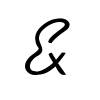
The picture on the right shows mine, which I adopted because my handwritten traditional ampersands always come out horribly crooked. (The image is ugly, I fear, but that’s what happens when I try to draw with a slippery optical mouse.)


Still, browsing through my fonts, I can find a few that do. The one on the left is from a font called Bradley Hand ITC, the one on the right shows the ampersand in Kaufmann Thin.


The symbol in the bottom-left corner is a “ksi”, an Ancient Greek letter that you can pronounce “ks”.
[…] #8221; messages at various websites. Indispensable Mac OS X products - ’nuff said. Pir(l)ouettes - a commentary on Adobe’s history of the ampersand. ACLU - Pizza - a funn […]
Jonathan Strange & Mr. Norrell Seminar
[La version anglaise est plus complète.]
Sur Crooked Timber, il se tient un « séminaire » portant sur le roman Jonathan Strange & Mr. Norrell de Susanna Clarke (livre en anglais via Amazon.fr), avec plusieurs articles dont un rédigé par l…