London Signage 03: m*ta-avoidance
Les mis en garde du métro londonien contre un comportement agressif des voyageurs utilisent la typographie et le remplacement de voyelles par des signes autrement plus habituellement utilisés pour camoufler les jurons.
Since last year, Transport for London has been running a series of posters aiming at improving passengers’ behaviour. To soften the underlying stern injunctions (”Don’t push!”, “Don’t block the closing doors to squeeze in at the last moment!”, “Keep your music volume down!”, “Don’t eat smelly or drippy food on the Tube!”), the designers have added graphical elements to the lettering — playing with fonts, molding the typography into cute little signs: the dripping fat from a portion of fries, the sound waves emanating from an iPod.
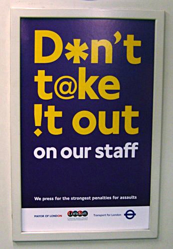
Here is the poster that deals with aggression towards Tube employees:

This is the first time I’ve seen a semiotic usage of the avoidance characters outside comic strips. By replacing some vowels with an asterisk, an exclamation mark and an at-sign, a layer of meaning is added to the otherwise somewhat cryptic statement “Don’t take it out on our staff”. The smaller print refers to assault, but given the visual effect, I’m sure verbal abuse is covered, too, by this warning.
Billets connexes : Not now, but during past hour, Unus, solus, totus, ullus..., BBC "Word 4 Word", Show me your vowels!, Finex ! Pooo !, Eggcorns and ditchwater, Thy "thee"s, Ed Felten...
Technorati (tags): language, linguistics, symbols, taboo language, typographie, UK

